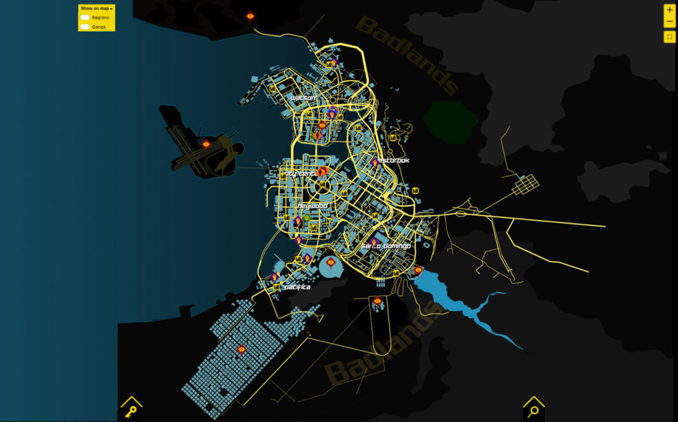
Thanks to everyone who has provided feedback on the Cyberpunk 2077 Interactive Map and a shoutout to the Reddit community for chipping in too. This latest update covers a few issues which should make life easier for map users and we now have an all-new map based on what appears to be the final in-game map.
Last week I started working on all the suggestions and implementing bug fixes. Then, during Night City Wire we finally got a better look at the final in-game map which meant finishing up the fixes and cracking on with v2.0 of the interactive map. Below I have detailed what’s changed on the new map and below that all the fixes.
New Map Layout
- Updated road/ building layout to reflect in-game changes.
- Changed map to reflect game styling.
- Orbital Station left on map but opacity reduced as it’s now not connected to the city. I am leaving it there because we do see it in the videos but it appears it is now not connected. Plus, it may appear as DLC at some point so it’s worth leaving.
I want to point out that until the game is released and we get more than a glimpse of the map with closer zoom, it’s incredibly hard to get all the road junctions/layout. This is especially tricky where roads pass through buildings.
I have thought hard about this, and there are two ways to show roads passing through buildings. One way would be to change opacity on where roads pass through. The other is to show the building but split in two so you can see the complete road path. Both have benefits because ultimately we all want to know how to get around. This also applies to roads passing under roads which again will be difficult to get 100% correct until we see the full map with height changes.
Also, some of the smaller roads may not be visible from the videos due the angles in the video. Roads may be tucked behind larger structures so some have been removed where it’s obvious they have been removed.
Placing buildings accurately right now is not really possible because of the image quality of the maps shown. However, I have done my best to remove/add buildings where possible at the moment. These will be tweaked when we see a decent hi-res map that can be rotated and height can be changed.
Improvements/Fixes
- Removed chat window to show by default to help mobile users. This can be toggled by clicking the chat icon in the top right.
- The map now scales correctly for mobiles when viewed in portrait mode.
- Map now positioned better at the center of a mobile device screen.
- Map lists now display correctly when selected in mobile.
- Users are now able to switch between List View and Map View on mobiles.
- New filters button for mobile users to select filters and improve usability..
- A few typos sorted from data entry input (thanks Virtenax).
These tweaks should make life easier when viewing on a smaller screen.
This work so far has taken a few days to complete on the road changes alone. Attempting to get the scale right as well as angles has been a challenge without messing up all the object markers. Annoyingly there was no way to work around some of the changes so some markers had to be repositioned on the map. Keep the feedback coming and I’ll crack on with further updates should they be needed in the days ahead. The plan is to get the map layout as complete as possible before release.


Add a Commment